Mysterious Hand-written Character
This is definitely not a post for beginners. If you’re an advanced learner or literate native speaker of Chinese and take an interest in character variants, you might enjoy this, though.
Take a look at this Chinese character, hand-written for a sign in my Shanghai office:
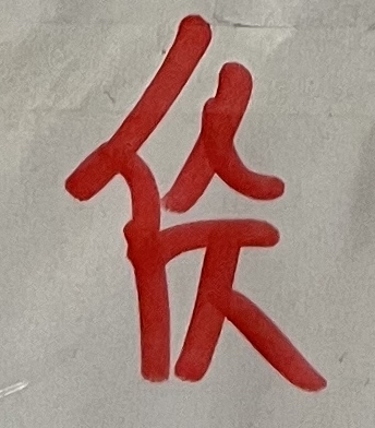
You’re likely having trouble deciphering that. On first glance, it looked to me like a person component on the left (亻), with two vertically-stacked 人 on the right, a 一 in between them. In fact, the bottom half almost looked like a Korean ㅈ to me. But no, this is Chinese, written by a native speaker/writer of Chinese, and intended for other Chinese people.
Here’s the character as part of a two-character word in context:
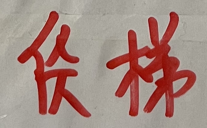
Easier to read now?
If you still can’t get it and your Chinese is sufficiently advanced, the rest of the context should make it clear enough:
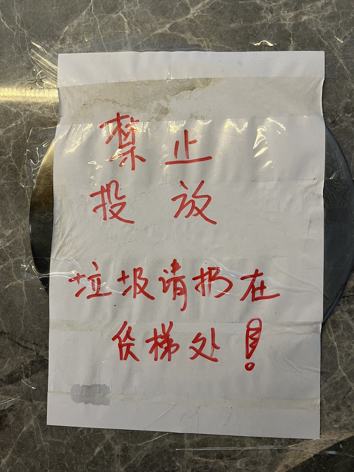
The notice reads:
禁止
投放
垃圾请扔在
货梯处!
So the mystery character here is 货 (huò), as in the word 货梯 (huò tī), or freight elevator.
Does this answer seem wrong to you? It felt wrong to me. I asked some native speakers if they could read it, showing them first the isolated character, then the full context. In every case, they couldn’t read it in isolation, but could read it in context, and while admitting it looked weird, didn’t agree that it was wrong… just sloppy.
OK, but now that we know that the character is supposed to be 货 (huò), we can make a bit more sense of it.

So here’s my analysis:
- First of all, what I originally thought was a 亻 down the left side is actually confined to the top half in a stubby 亻, the bottom of which overlaps with the form beneath it.
- The top of this character should be 化, but the right side is definitely 人 rather than 匕. I’m not sure how anyone could argue otherwise. I see this as mistake #1.
- The bottom part should be 贝, but there’s a stroke missing. I see a 厂 with a 人 inside it (仄). Not sure how you can say there’s not a stroke clearly missing on the right side. I see this is mistake #2.
Given these two clear mistakes (?), I’m not sure why native speakers don’t feel like this character is blatantly wrong, like I do. (If it’s worth anything, my fourth grader, a life-long student of the Chinese school system, couldn’t get how that could be 货 either.) But hey, differences in perception are a big part of what makes this whole language-learning adventure fun.
And, good thing actual hand-to-paper writing is becoming a thing of the past, right??
(But in all seriousness, I do welcome additional analysis!)
P.S. This is a good example where being familiar with the structural patterns of Chinese characters is useful. What I originally assumed to be ⿰ (with a ⿱ embedded on the right side) was actually ⿱. Greater familiarity with different structures gives your mind greater flexibility in character recognition.
Great post. I showed this to a native speaker friend who also was only able to recognize the character in context as 货梯, but would consider the individual character in the first picture as written incorrectly. Another nuance was had the half-written 贝 been covered up in the first picture, they would have been able to recognize the character. The 匕 that looks like 人 wouldn’t pose a problem in identification.
Around 1985 I was walking with a couple Harbin Institute of Technology graduate engineering students one day when one of them pointed at a vertical sign for a work unit (I think it was an office of the Railway Bureau) and asked me what I thought of the calligraphy. It looked fine to me. It was one of those signs with the characters carved in a long piece of wood, black characters on white or white on black, I forget which. He pointed at one of the characters and said that it didn’t exist – it was an error. His hobby was calligraphy. I had heard that there were unauthorized characters but this was the first one that had been pointed out to me. I knew that people sometimes skipped strokes but people knew what those characters were. I did that when writing on baggage tags. Everyone knew what I wrote meant “Harbin” even if I had slurred my writing a bit.
My first year in Harbin (at the Harbin Educational College) I was walking along and saw a bi-lingual sign that another teacher had spotted. It was one of those that was made to look like the Chinese and English writing had been etched into bronze. It identified the place as the “Harbin Shirt Fartory.” I’m not kidding! There were three men near the sign, unloading gas bottles. One of them looked like a cadre. I walked up and pointed at the misspelled word and told the man with nicer clothes (in Mandarin) that that word was incorrect. He answered that they knew but the sign was expensive. True story!
Ha! Thanks fo the story.
I’ve seen some of those unofficial simplifications around over the years, most commonly the one for 停 (亻+丁). I believe that one in particular was a part of the last round of simplifications that was rescinded and abandoned.
This is a sort of straightened-out version of the cursive form (草书楷化). Check out 行书 and 草书 variants of 货 on http://www.shufazidian.com/ and you’ll start to see it. Some forms omit the right-hand vertical stroke in 贝 altogether, making it resemble 仄 or [厂+大].
The top right 人 is a bit weird, but understandable from a 草书楷化 standpoint.
Thanks so much for the comment. Good to have an expert weigh in. This is well beyond me.