Dian Dian Sha
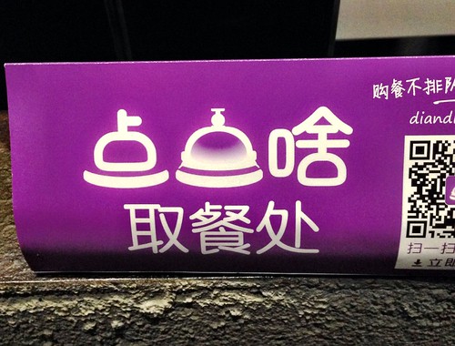
This is the logo for a service called 点点啥 (Dian Dian Sha):
So this is the Chinese verb 点 (meaning “to order (food)”), reduplicated. The word 啥 is a colloquial way to say 什么 (“what”), used more in northern China.
Nice characterplay here, the second 点 replaced by the service bell, while the first 点 is modified a bit to look more like the bell.
One thing beginners might not know is that the character component consisting of four short diagonal lines (as in 点) is frequently written as a single horizontal line. You can actually see this in some PRC character simplifications:
- 魚 → 鱼
- 馬 → 马
Obviously, it’s not applied across the board, leaving us with characters like 点, 热, and 煮, which still use the four short diagonal lines in printed form. In handwritten forms (or certain fonts), even those four short lines frequently get turned into a horizontal line (usually kinda squiggly).
点点啥 (Dian Dian Sha) has an app aimed at reduced food-related wait times.

