ICBC’s Creative Character Writing
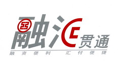
I’ve written about this before. I like creative ways of writing of Chinese characters. Here’s a simple one by 工商银行 (Industrial and Commercial Bank of China):
The characters read 融汇贯通, a kind of financial service the bank offers. The red part in 融 is the bank’s logo. The red part in 汇 looks similar to the bank’s logo, but actually more closely resembles half of an old-style Chinese coin, with the square hole in the middle. (The character 汇 refers to “currency.”)


the hui looks cool, the rong does not.
ash,
Yeah, I agree. I still give them points for trying.
I wonder if foreign companies get away with doing that. Maybe if it’s really well done.
So where’s the “B”? Did it fly off? Or is included in “financial institution”?
The red half-a-character in 汇 looks very similar to the logo for Bank of China. In fact, because of this I thought at first glance that this post was about the characters in a Bank of China sign. I wonder how ICBC would fare if BoC accused them of trademark violation.
quote
that’s right! cause ICBC cut BOC’s logo into halves and dare not to show the entire one. LOOK… LOOK AT the right part of 汇, i’m surely they stole it from BOC.
so… this is… a Business Cooperation???